
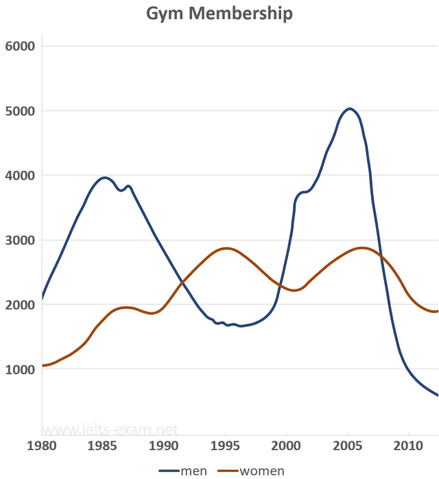
The graph illustrates the
men
's and Use synonyms
women
's participation in gyms between 1980 and 2010.
Use synonyms
Overall
, the proportion of males is over the number of females meanwhile during the period.
Linking Words
According to
the graph , we can be seen clearly that , the rate of Linking Words
men
grew dramatically with a lot of fluctuations from the beginning of the period to 2010, Use synonyms
However
, the Linking Words
women
's percentages were Use synonyms
also
different over the years ,when analysing the figure for Linking Words
men
we can be clear seeing that ,rates have many fluctuations ,It started with point 2000 Use synonyms
Then
it become 4000 in 1985 .In 2005 it significantly increased to 5000 before declining to 1000 Linking Words
at the end
of the period .Linking Words
Whereas
, the figure for Linking Words
women
has slight fluctuations Use synonyms
while
the time , that had observed from 1000 to 2500 slightly increased to be in 2000 Linking Words
finally
, Fo Linking Words
this
result we can say the Linking Words
men
's rates was more active compared with Use synonyms
women
's rate.Use synonyms