
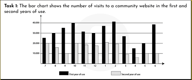
The provided bar chart presents data on the utilization of a website's community by its guests over a span of two years, from September to August.
In general, both categories displayed an upward trajectory. The graph illustrates that the proportion of visitors in their second year of use exceeded that of the first year.
However
, towards the end of the period, the first year of use reclaimed the top position, surpassing the other category.
In September, the number of first-year visitors was approximately 1800, gradually increasing to 1000 in November before stabilizing the following month. Linking Words
Moreover
, it experienced a considerable decline in the subsequent two months, hitting a low point of around 700, followed by a remarkable surge to 15000 Linking Words
at the end
of the period.
Linking Words
Conversely
, the count of second-year visitors experienced significant growth from September to December, reaching approximately 17500 before declining by nearly threefold to 1000. Linking Words
However
, it steadily rose again, reaching a peak of 2500, and Linking Words
subsequently
declined to approximately 1250.Linking Words