
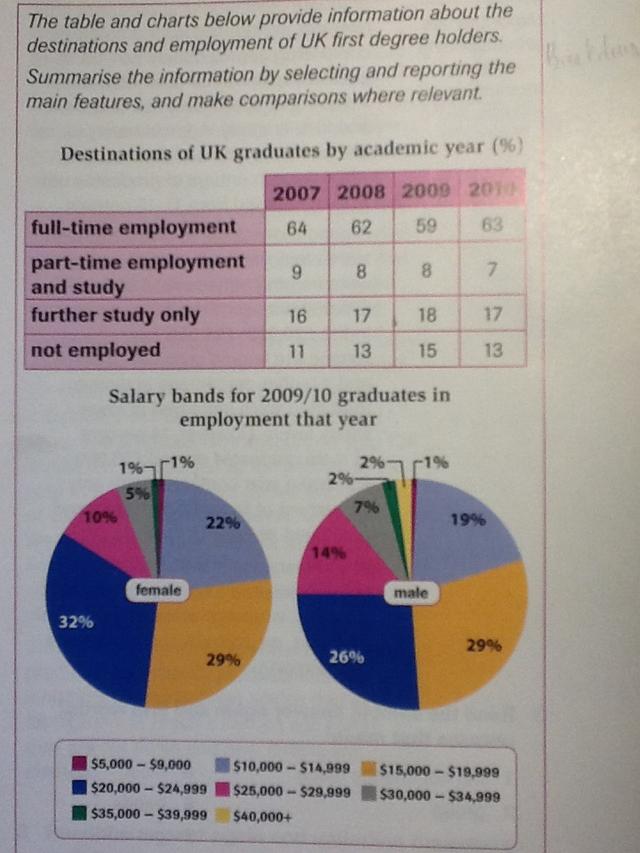
The two pie charts compare the salaries of graduates in employment and are differentiated by gender in two years. The data is given by percentages.
It can be seen that the average of both males and females is around 15,000-19,999
dollars
and 20,000-29,999 Use synonyms
dollars
. Meanwhile. The only view of them gets varied payment.
It is obvious that around 29 per Use synonyms
cent
of graduates got paid 15,000-19,999 Use synonyms
dollars
. Use synonyms
This
percentage was similar for both genders. Linking Words
However
, females graduating got income higher by 20,000-24,999 Linking Words
dollars
compared to males different 6 per Use synonyms
cent
. Use synonyms
Nevertheless
, there were 10 per Linking Words
cent
of males made money of around 25,000-29,999 Use synonyms
dollars
, Use synonyms
while
4 per Linking Words
cent
higher was made by females.
Use synonyms
Furthermore
, 22 per Linking Words
cent
of employees of men had jobs with payments of 10,000-14,999 Use synonyms
dollars
and less than 3 per Use synonyms
cent
of women got the same amount of payment. And the data describe that around 2 per Use synonyms
cent
of female employees get the highest salary (40,000+ Use synonyms
dollars
).Use synonyms