
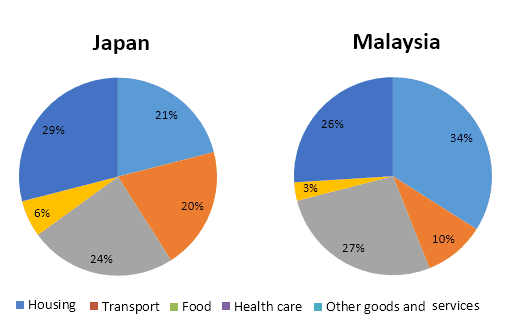
The pie chart illustrates the average expenses of households in Japan and Malaysia in 2010 based on five categories.
Overall
, other goods and services contributed the most to the economy of Japan, Linking Words
while
Linking Words
health
Use synonyms
care
was the smallest segment. Use synonyms
In contrast
, housing made up the biggest part of the chart of Malaysia and the lowest contribution was made by Linking Words
health
Use synonyms
care
.
In 2010, the Japanese spent 29% of its expenditure on other goods and services, which was 3% greater than that of Malaysians. Use synonyms
Moreover
, Japanese people spent twofold times more on transport and Linking Words
health
Use synonyms
care
than Malaysian citizens.
Use synonyms
However
, one-third(34%) currency of Malaysians is expended on housing, followed by food which comprised 27% of their total expenses. Money spent on transport and Linking Words
health
Use synonyms
care
was comparatively less than Japanese and they contributed 10% and 3% respectively. Use synonyms
On the other hand
, money spent on Linking Words
health
Use synonyms
care
services was the least in both countries, which accounted for an insignificant proportion.Use synonyms