
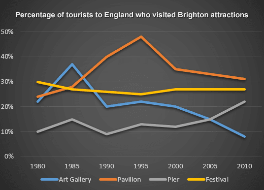
The line graph illustrates the percentage of England tourists who visited the Art Gallery, the Pavilion , the Pier and the Festival from Brighton between 1980 and 2010.
Overall
, Linking Words
while
the number of individuals visiting the Pavilion ,the Art Gallery and the Pier encountered significant variations in the given period, the proportion of tourists going to the Festival remained approximately the same.
Linking Words
Firstly
, starting with the attractions that have had the biggest variations , the proportion of England visitors who went to the Galery started at over 20% ,reached its peak in 1985, nearly 40%, and Linking Words
then
dropped dramatically until 2010, to less than 10%. The other artefact,the Pavilion started from more than 20% in 1980, reached its maximum of nearly 50% in 1995 and Linking Words
then
decreased to 30%, Linking Words
additionally
becoming the most visited attraction in 2010.
Linking Words
Next,
continuing with the artefacts that have not had significant changes , the percentage of England tourists who visited the Pier started from 10% at the beginning of the period and became 20% Linking Words
at the end
. The number of Festival participants remained constant in all years, with small deviations of around 30%.Linking Words