
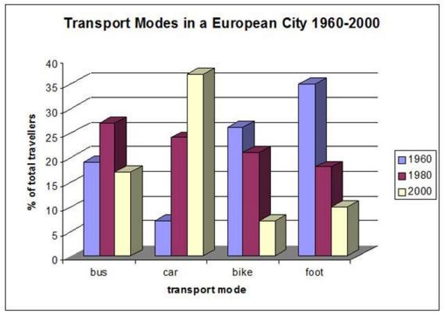
The provided diagram illustrates the proportion of various transportation used to travel and work over 40-year periods in Europe.
Overall
, the histogram portrays the fluctuations in transportation systems we can see clearly that in 1960 the Linking Words
car
was the lowest way for people to use Use synonyms
while
in, contrast during 20's century Linking Words
car
was the most used vehicle throughout the reporting period.
Observing the details, it is remarkable that the majority of the population preferred to travel by foot approximately 35% in 1960 followed by bike at 25% Use synonyms
then
bus at 17%. Linking Words
Whereas
, the Linking Words
car
was on the bottom line in 1960. The comparable, the bus reached its peak at nearly 25% in 1980 when the Use synonyms
car
became more popular and soared to 23% followed by bike at 20% and foot at roughly 10%.
Use synonyms
On the contrary
, in 2000 the Linking Words
car
became the most used transportation at a peak of 35% Use synonyms
although
the bus slightly decreased to 15%. Linking Words
Similarly
, foot dropped a half used from 1980 to 10% and bike sank to the lowest level at 5% in 2000.Linking Words