
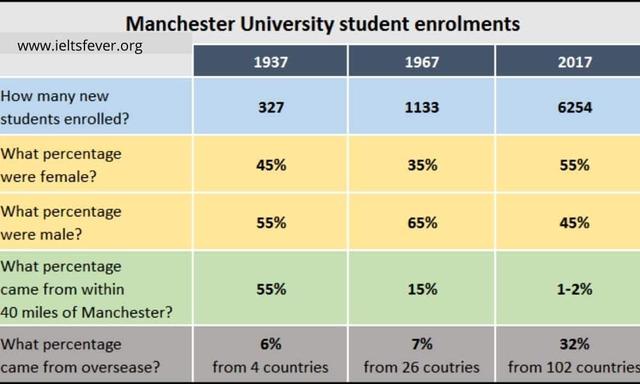
The diagram below illustrates the percentage of those students who apply to Manchester University over 80-year periods.
Overall
, it is clear from the table that the total sum of student enrolments significantly increased over 80 years, Linking Words
while
in, contrast the proportion of female, and male overseas and surrounding populations changed throughout the reporting period.
Observing the details, it is remarkable that junior applicants dramatically rose from 327 in 1937 to 6254 in 2017. Linking Words
Similarly
, the fraction of overseas learners massively climbed from 6% at the beginning and remained at 32% in 2017. Comparably, the fractions of female and male students are shifted, 1937 Masculine populations were greater than feminine approximately 10% Linking Words
whereas
in 2017 the feminine reached its peak at 55% followed by masculine around 45%.
It is noticeable that at the beginning nearly 55% of all applicants were those individuals who lived within 40 miles of Manchester compared to the 20th century, there were only 1-2% that lived near the College.Linking Words