
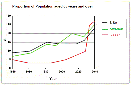
The line graph depicts information about the population of individuals who peaked at 65 years old and over measured in 6 periods between 1940 and 2040 in Japan, Sweden, and the United States.
Overall
, Sweden and the US started at the same levels, Linking Words
moreover
, finished the same, with some fluctuating periods. Linking Words
However
, the Japanese oldest ones fluctuated at the same point 60 years.
Linking Words
To begin
with, Sweden and the United States line’s started at 7 and 9, respectively, gradually increasing until the 1990s, when Sweden’s residents dramatically increased to 20% in 2010 and will peak at 25% in 2040, Linking Words
while
the Americans will peak at 20% by steadily enhancing in the end.
Linking Words
On the other hand
, Japan’s line began at the lowest rate of the statistics and was low until 2010. Linking Words
Subsequently
, the land of the rising sun 65+ livers will increase slightly until 2030 and drastically rise to 28% in 2040.Linking Words