
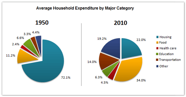
The average household expenditures in a particular country in 1950 and 2010 have been shown in two pie charts separately.
It is evident that the largest portion of expenditures in 1950 belongs to housing which is 72.1%.
However
, food is obviously the largest piece of expenditures in 2010 which is 34%. Linking Words
Furthermore
, both in 1950 and 2010, payment percentages for health care were the least which were 2.4 and 4.3 in order.
To delve deeper into the data, housing is 22%; the second largest percentage of payments of families in 2010. Linking Words
Additionally
, the third largest portion in 2010 that was 19.2% belongs to other affairs which are not classified precisely, Linking Words
although
it was only 4.4% in 1950. Linking Words
Furthermore
, the second portion in the pie chart for 1950 is food which is 11.2%. Linking Words
It is clear that
people spent more money on their food in 2010 compared to 1950 rather than housing. Linking Words
However
, education and transportation were the second and third least portions in both years.Linking Words