The chart below gives information about how families in one country spent their weekly income in 1968 and in 2018. Summarize the information by selecting and reporting the main features, and make comparisons where relevant.

The chart below gives information about how families in one country spent their weekly income in 1968 and in 2018. Summarize the information by selecting and reporting the main features, and make comparisons where relevant.
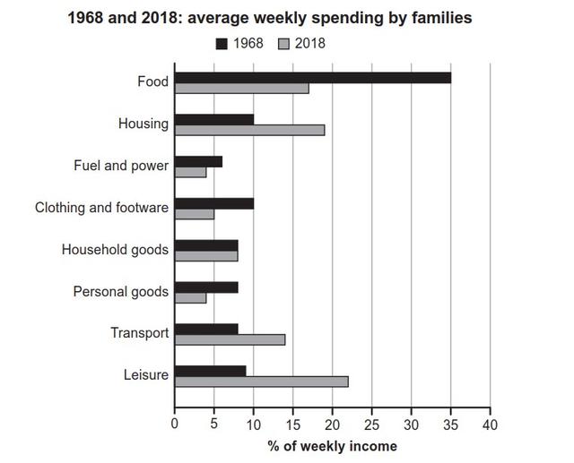
The bar chart shows data about families' weekly income spending, and it is talking about
specific
Add an article
a specific
show examples
time which is a comparison between 1968 and 2018.
According to
the chart, family spending increased in some stuff,
for instance
, they spent 8% on Transport in 1968,
then
it increased intel it is become 14% in 2018,
in addition
, leisure and housing spending increased too. To some up, we could say that people's weekly income in 1968 became so different in 2018, so that leads us to the fact that nations interest is going to be changed in the future.
Submitted by statltg1357 on

Unauthorized use and/or duplication of this material without express and written permission from this site’s author and/or owner is strictly prohibited. Excerpts and links may be used, provided that full and clear credit is given to Writing9 with appropriate and specific direction to the original content.

Common mistake: Your writing should be 150-250 words.
Vocabulary: The word "chart" was used 2 times.
Vocabulary: The word "increased" was used 3 times.
Vocabulary: The word "about" was used 2 times.
Topic Vocabulary:
  • expenditure patterns
  • proportion
  • weekly income
  • accounted for
  • total expenditure
  • housing and utility expenses
  • transportation costs
  • other expenses
  • education
  • healthcare
  • leisure activities
  • spending patterns
  • witnessed a considerable rise
  • experienced a substantial increase
  • allocating a larger proportion
  • reducing their expenditure
What to do next:
Look at other essays: