
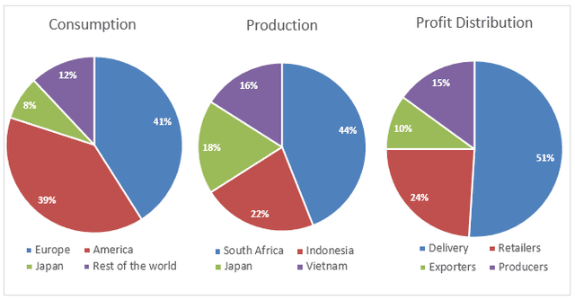
The pie chart illustrates the differences in global coffee consumption, the leading four communities when it comes to producing caffeine, and how its income contributed to all around the world.
Overall
, it is readily apparent that Europe was the leading country with a statistic of 41%, followed by America accounted for 39%. Linking Words
Moreover
, Japan and the rest of the world showed a total of 20% which is about half of Europe.
On the one hand, South Africa appeared to be the largest espresso producer Linking Words
whereas
Vietnam had a sum of 16% which was the lowest of the most surveys. Linking Words
However
, both Japan and Indonesia demonstrated percentages of 18% and 22% respectively.
Linking Words
On the other hand
, most of the harvest came from the delivery of coffee, which was approximately half of the total survey at 55%. Linking Words
Additionally
, the figure for retailers accounted for 23% Linking Words
while
the remaining profit was divided among exporters and producers at 10% and 15% respectively.Linking Words