
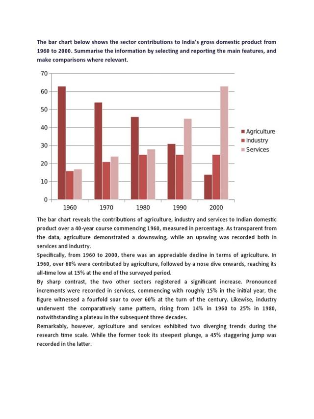
The given bar chart represents the comparison of India's gross domestic product contributed by 3 different sectors between the years 1960 and 2000. The sectors are namely agriculture, industry, and services.
overall
, it is clearly observed from the graph that the contribution of the agricultural department to the gross domestic product declined constantly during the given time period, Linking Words
whereas
the exact opposite scenario was noticed in the case of services, which showed a steady inclination.
Linking Words
To begin
with, in the year 1960, the agriculture sector accounted for almost 62%. Interestingly, the values dropped significantly and reached the lowest point of 15% in 2000. Talking about the industrial contribution, the numbers reached around 25% from 15% between the years 1960 and 1980. After that, the values remained unchanged. Surprisingly, the service sector showed considerable growth. It made up around 17% in 1960 and culminated at just above 60% in the year 2000.Linking Words