
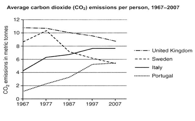
The line graph compares the average
carbon
emissions per capita in four European countries namely the United Use synonyms
Kingdom
, Use synonyms
Sweden
, Italy, and Portugal between 1967 and 2007, measured in metric tonnes. Use synonyms
Overall
, the United Linking Words
Kingdom
had the highest statistic from time to time Use synonyms
although
it gradually declined. Linking Words
In contrast
, Portugal had the lowest radiation but dramatically rose in four decades.
The United Linking Words
Kingdom
Use synonyms
initially
reported approximately 11 Linking Words
million
metric tonnes of Use synonyms
carbon
releases in 1967. Use synonyms
However
, starting from 1987, the figure consistently decreased to under 10 Linking Words
million
and landed at around 9 Use synonyms
million
by the end of the reporting period. Other than the United Use synonyms
Kingdom
, Use synonyms
Sweden
Use synonyms
also
had a diminishing trend with the exception of a spike in 1977 which reached beyond 10 Linking Words
million
. Use synonyms
Nevertheless
, Linking Words
Sweden
's emissions continued to fall until below 6 Use synonyms
million
in 2007.
Use synonyms
On the other hand
, Italy's Linking Words
carbon
pollution moderately increased from age to age. It started lower than Use synonyms
Sweden
's at barely above 4 Use synonyms
million
in 1967 but ended up higher in a higher number at almost 8 Use synonyms
million
in 40 years. Use synonyms
Lastly
, Portugal with the lowest releases in all years ironically had the highest jump. It released under 2 Linking Words
million
Use synonyms
carbon
dioxide discharges by the beginning of the period but managed to triple the number in four decades, reaching the same point as Use synonyms
Sweden
in 2007.Use synonyms