
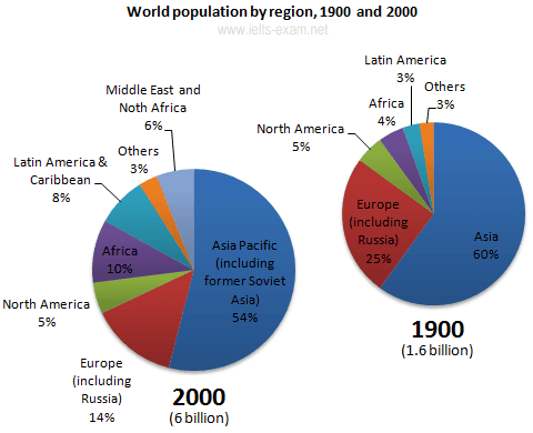
The provided pie graphs show the data regarding the incline,
as well as
, the decline of the general population across the globe in a span of 100 years from 1900 to 2000. Linking Words
According to
the given charts, there were approximately seven categories: Asia, Europe, Linking Words
Africa
, Latin America, Middle East and North Use synonyms
Africa
, North America, and others.
Use synonyms
Overall
, after a thorough analysis of the provided data, it can be plainly viewed that Linking Words
while
the Asian population registered the highest percentage over the period, Latin Americans came Linking Words
last
with the lowest proportion.
In the beginning, regarding the year 1900, the figure for the Linking Words
overall
population was 1.6 billion people, and Asia formed the majority of Linking Words
this
number and scored 60%, followed by Europe ( including Russia) which recorded 25% in the same year. Linking Words
Furthermore
, North America Linking Words
in addition
to Linking Words
Africa
were almost the same and hit 5% and 4%, respectively.
Use synonyms
Moreover
, moving to the year 2000, there was a dramatic increase in the number of people around the plant ( reached 6 billion individuals ). Whilst Asian people, again, scored the highest proportion with 54%, Europe located in second place with only 14 per cent. Linking Words
Finally
, it is worth noticing that in 2000, a new category occurred and it was the Middle East and North Linking Words
Africa
which scored 6 per cent. Use synonyms
However
, regarding the remaining unclassified category ( the Others) the percentage was equal over the period and scored only 3%.Linking Words