
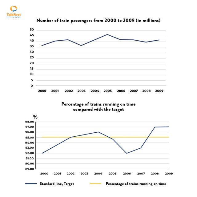
The first chart presents how many people used the train
whereas
the second diagram compares the differences between the proportion of Linking Words
trains
running punctually and the objective from 2000 to 2009.
Use synonyms
Overall
, despite some fluxes, there was an increase in the number of passengers utilizing Linking Words
trains
and the percentage of Use synonyms
trains
starting on time through 10 years. Meanwhile, the figures for the annual target were consistently 95% and had no changes over the period.
In 2000, about 37 Use synonyms
billion
commuters used the train as their means of transport, followed by a significant fluctuation before reaching a peak of nearly 50 Use synonyms
billion
in 2005. The total of train passengers Use synonyms
subsequently
dropped to exactly 40 Linking Words
billion
in 2008, but it later saw a slight growth to around 45 Use synonyms
billion
Use synonyms
at the end
of the stage examined.
Linking Words
According to
the second graph, the share of Linking Words
trains
being punctual as their schedule was 92% at the beginning, after which it sharply rose to 96% in 2004 and surpassed the standard number. The percentage declined to 92% in the next two years, before experiencing a dramatic oscillation to reach 97% in the final year.Use synonyms