
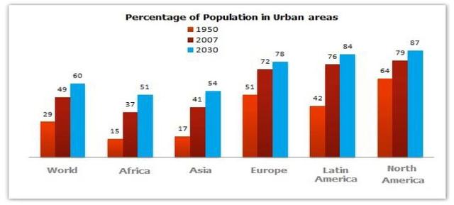
The bar chart above illustrates statistics of the inhabitants living in cities in certain countries in 1950, 2007, and 2050. The data given is measured in percentages.
Overall
, it is noticeable that North America represents the largest society in the world. Linking Words
In contrast
, Africa makes up fewer citizens than any other nation.
Linking Words
To begin
with, in 1950, the American people living in the North accounted for 64 per cent similar to Oceania which had 62 rates. Linking Words
Furthermore
, in 2007, both began to compete with just a slight difference in nominal 79% for Americans and 71% for South Pacific. Linking Words
In addition
, from the forecasts, we can see that the US is far superior with 90 chunks. In the meantime, other continents Linking Words
such
as Europe and the Caribbean divided into middle-size populations as in not so crowded or deserted.
Linking Words
Finally
, the smallest parts of the communities will be living in Africa and Asia with only just 15% and 17% in 1950, respectively. Linking Words
Moreover
, in 2007, sharply increased to 37% for Africans and 41% for Asians. Linking Words
Nevertheless
, for the projection it still stands at the bottom in comparison to other states.Linking Words