
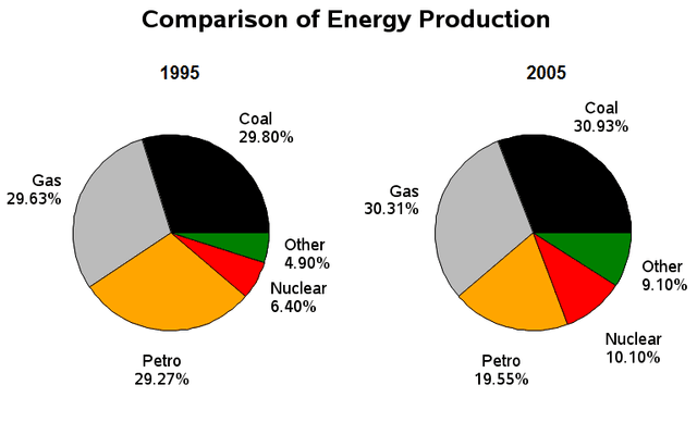
The pie
charts
compare the source of Use synonyms
energy
in a specific country in 1995 and 2005.
Looking from an Use synonyms
overall
perspective, Linking Words
energy
in Use synonyms
this
country was primarily sourced from coal and gas in both selected years. Linking Words
In addition
to Linking Words
this
, all the sources in the provided Linking Words
charts
saw an upward trend, except for Petro.
It is evidently apparent from the Use synonyms
charts
that Use synonyms
energy
was predominantly produced from coal, with 29.80% and 30.93% of the total amount of Use synonyms
energy
manufactured from Use synonyms
this
in 1995 and 2005, respectively. That was closely followed by gas which accounted for 29.63% of Linking Words
energy
generation in 1995 and 30.31% in 2005, representing the second-most-popular Use synonyms
energy
source in both years.
Nuclear power contributed only 6.40% of the 1995 Use synonyms
energy
Use synonyms
while
by 2005, the figure for Linking Words
this
had increased by 4.6% and reached 10.10%. Linking Words
In contrast
, the percentage of Linking Words
energy
transformed from Petro indicates the most dramatic drop compared to other sources in the Use synonyms
charts
, falling significantly from 29.27% to 19.55% between 1995 and 2005.Use synonyms