
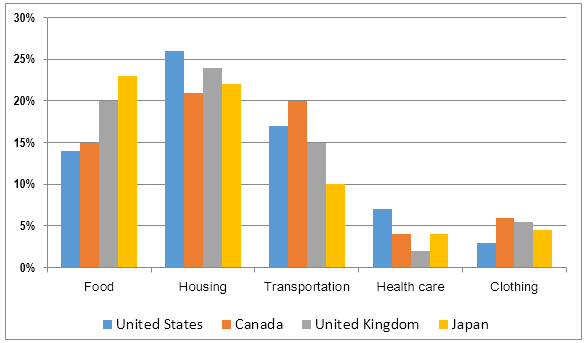
The chart illustrates the percentage of the expenses for five different categories including food, housing, transportation, health care and clothing in four countries.
Overall
, Linking Words
it is clear that
more people spend their income on their life, which is related to eating, households and traffic, and their less concentration is on healthcare and clothing.
Linking Words
To begin
with, the rate of expenditure for cleaning the house is higher than others, which is 25%,21%,23% and 22% in the United States, Canada, the United Kingdom and Japan respectively, Linking Words
while
the clothes and the assurance are lower than 10%. Linking Words
Moreover
, Japan spends the majority of its shares on food and housing and the figures are 23% and 22% respectively, Linking Words
whereas
the proportion of health care is lower than four times.
Linking Words
In addition
, individuals living in Canada tend to consume their revenue for transportation at 20%; Linking Words
however
, the share of the care for health is only 4%. In the United States, the expenditure on housing is the highest rate, which is around 26%.Linking Words