
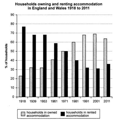
The bar chart is divided into two categories based on
households
in owned accommodation and Use synonyms
households
in rented accommodation from 1918 to 2011 in two different countries England and Wales.
At first glance, Use synonyms
households
in rented Use synonyms
houses
had the highest percentage, and it decreased dramatically Use synonyms
while
Linking Words
households
in owned Use synonyms
houses
increased during these years.
It can be seen that in 1918, Use synonyms
households
in owned Use synonyms
houses
had the lowest rate with a little more than 20%. After that, its percentage rose to 30% and remained steady between 1939 and 1953. In 1971, it reached the figure for Use synonyms
households
in rented accommodations at 50%. after 20 years it rose to a peak of around 70% Use synonyms
whereas
it saw a minor decrease in 2011 by 5%.
Looking at Linking Words
households
in rented Use synonyms
houses
it is obvious a great proportion of people tend to rent Use synonyms
houses
at just under 80%, and during these years Use synonyms
this
rate reduced dramatically to almost 40%.Linking Words