
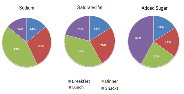
The pie charts are divided into four categories breakfast, lunch, dinner, and snacks. The charts compare the average percentage of
Sodium
, Saturated fat, and Added Use synonyms
sugar
in each ordinary meal in the USA.
At first glance, the Use synonyms
Sodium
and saturated fat in dinner meals are more than other meals Use synonyms
whereas
the rate of Linking Words
sugar
is far more than other nutrients in snacks. All substances have low and equal figures for breakfast.
It can be seen that Snacks dramatically contain Use synonyms
sugar
at a little over 40% Use synonyms
while
the figures for other nutrients are 14% and 21%. Meals that are consumed at night have the highest proportion of Linking Words
sodium
and saturated fat at around Use synonyms
two- fifth
, and a little under 40% respectively.
The percentage of all three continents Correct your spelling
two-fifths
are
approximately equal in breakfast at 16%. Correct subject-verb agreement
is
Similarly
, Linking Words
sodium
and saturated fat in lunch have the same figures at 29% and 26%. Use synonyms
Linking Words
by
contrast Capitalize word
By
this
rate for added Linking Words
sugar
is 19%.Use synonyms