
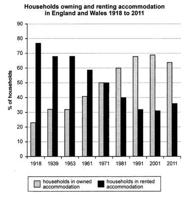
The bar chart compares changes in the
number
of rented and owned accommodation in England and Wales from 1918 to 2011.
Use synonyms
Overall
, the Linking Words
number
of individuals who were owners of their properties increased, Use synonyms
while
the Linking Words
number
of rented houses decreased. Use synonyms
Moreover
, both had the same figure in the middle of the survey.
As can be seen from the bar chart, Linking Words
initially
the figure for rented houses was at the highest amount at under 80%, Linking Words
while
that for owned was over 20%. The former fell by 50 and stood at the lowest proportion between 1991 and 2001. In 1971, both had the same and divided into half of the figure.
Linking Words
However
, the Linking Words
number
of owners increased until it overstriped the downward trend of rental accommodations after 1971, and reached Use synonyms
at
peak of approximately 70 in 2001. Correct your spelling
a
Finally
, those who owned their property experienced a decrease by a narrow margin, Linking Words
whereas
the rent witnessed an increase, both by 5 in an inverse way.Linking Words