
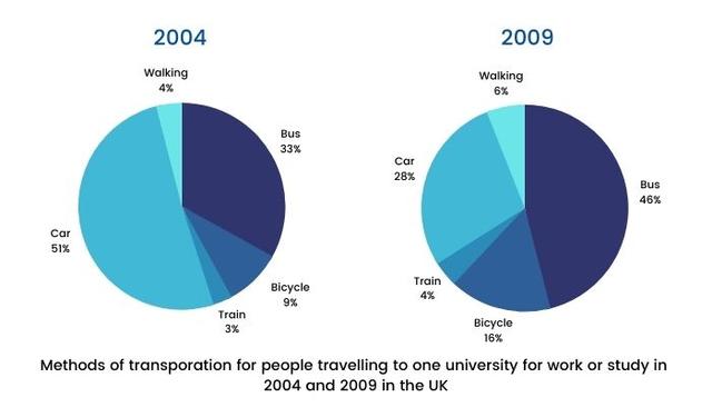
The diagrams illustrate the percentage of different ways to commute to university in 2 time periods: 2004 and 2009.
Overall
, Linking Words
it is clear that
there was a transformation of major methods from cars in 2004 to buses in 2009. Linking Words
In contrast
, the train was the lowest choice of transportation in both years.
Linking Words
According to
the data, the main trend in 2004 was travelling by car to the university, which accounted for over half. Linking Words
However
, in 2009, the amount of people using cars dropped to 28 per cent. With respect to the bus category, occupied a third in 2004 and climbed to almost a half in the year 2009.
As regards remaining data, people who cycled to university rose 7 per cent, from 9 to 16 in Linking Words
5 - year
periods. Correct your spelling
5-year
In addition
, the number of people using trains and walking was a very small number, accounting for 3 and 4 per cent respectively and changed marginally over time.Linking Words