
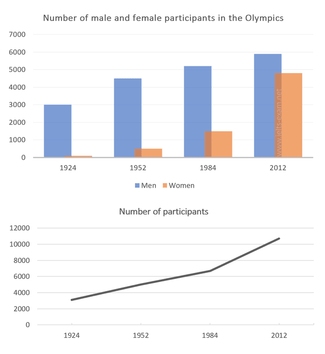
The given
chart
and graph have data relating to participants who entered the Olympics between 1924 and 2012.
Use synonyms
Overall
, the Linking Words
chart
showed that Use synonyms
men
's Use synonyms
percentages
were always higher than Use synonyms
women
a lot. In 2012, both male and female participants had the highest Use synonyms
percentages
before. The graph showed that the portion of participants rose every year.
Looking at the Use synonyms
chart
, both male and female sections rose up. Use synonyms
Men
's commission was more popular than Use synonyms
women
's, Use synonyms
Linking Words
that
is why the Correct pronoun usage
which
men
's Use synonyms
chart
was clearly higher than Use synonyms
women
's . In 1984, the female percentage had a big explosion Use synonyms
that
Correct pronoun usage
apply
women
's percentage was higher than in many years before nearly 1000. Use synonyms
Women
's Use synonyms
percentages
were the same as Use synonyms
men
's Use synonyms
percentages
in 1952, and it was the highest of all rates.
In the graph, it shows the data that athletics was increasing more and more. In 1924, the Olympic games had 3000 athletes, but Use synonyms
this
rose each year. But in 1984, it rocketed to nearly 11,000 people joining games and it was the year Linking Words
women
and Use synonyms
men
athletics adhered to most.Use synonyms