
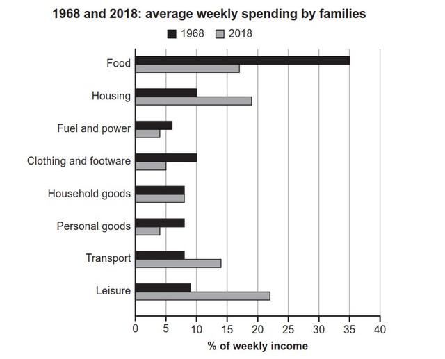
The given bar chart illustrates the weekly expenses of family members in a country separated into eight categories in 1968 and 2018.
Overall
, the trend showed that the most spending in 1968 was on food, Linking Words
while
the least was Linking Words
fuel
energy. Change preposition
on fuel
Moreover
, in 2018, it can be seen that people spent their money on leisure activities and only limited spending on fuel and personal Linking Words
goods
.
Starting in 1968, the majority of household members tended to use their weekly perks for buying food and drinks at 35%, followed by housing expenses and entertainment activities in their leisure time were around 10%. Use synonyms
In addition
, the percentage of household, personal Linking Words
goods
, and transportation were exactly the same approximately above 5%.
Use synonyms
On the other hand
, the trend has changed over 40 years later, in 2018, when they went out the most to do leisure activities the most spending by almost a quarter. Linking Words
However
, the allocated salary for fuel power and personal Linking Words
goods
in a week was slightly below 5%. Interestingly, in both years, the family members purchased a similar number of household Use synonyms
goods
by under 10%Use synonyms