
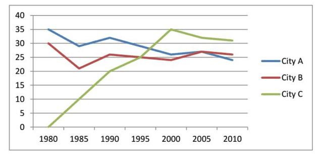
The line graph depicts data from global forums in three different cities between 1980 and 2010.
From an
overall
perspective, it is noticeable that international conferences in Linking Words
City
C showed an upward trend during Use synonyms
this
period. Linking Words
In contrast
, the ones in Linking Words
City
B and Use synonyms
City
A experienced a downward trend.
In 1980, Use synonyms
city
A was by far the most popular location for seminars (35), but it dropped to a low of roughly 25 in 2010 after experiencing fluctuations. Meanwhile, there were 30 meetings conducted in Use synonyms
city
B at the start of the time, which decreased to a low of approximately 21 in 1985 before rebounding to the same level as Use synonyms
city
A's Use synonyms
at the end
of the timeline, with a small dip in 2000.
In comparison, hardly any symposiums were organized in capital Linking Words
city
C in 1980. Use synonyms
However
, the number surged to an all-time high (35) over the next two decades. In the following ten years, it declined to just over 30.Linking Words