
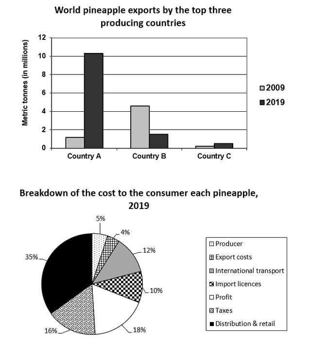
The two charts display the information on pineapples.The bar chart illustrates the exports of
pineapple
in three different countries with instruments in millions in 2009 and 2019.Another pie chart shows the cost of Use synonyms
pineapple
for each consumer in per cent in the year 2019.
In 2009 and 2019,Country A shows a significant rise in figures from one Use synonyms
million
to ten Use synonyms
million
.Use synonyms
In contrast
,country B has dropped in export of Linking Words
pineapple
from 4.5 Use synonyms
million
to 1.8 Use synonyms
million
.As for country C has a small rise in the figures.The pie chart for 2019 is divided into 7 consumers.The producer and export costs are the lowest in percentage among the seven categories with 5% and 4% each.Followed by the import licences and international transport with 10% and 12% each.Next,the profit and taxes total 34%.Use synonyms
Finally
,the higher in figures is the distribution and retail with 35%.
Linking Words
Overall
,all three countries have decreased the number of exports for the past ten years and the distribution and retail have the higher costs of consuming Linking Words
pineapple
.Use synonyms