
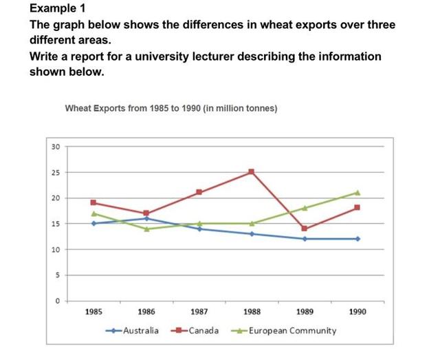
The line chart provides information on the export of
wheat
in Use synonyms
Australia
, Canada and the European community.
Use synonyms
Overall
, it can be seen that the amount of Linking Words
wheat
which was exported in Canada and the European community increased with some fluctuations but the export in Use synonyms
Australia
decreased over time.
Looking at the data sets that increased in more detail, it is evident that Use synonyms
wheat
exports in the European community stood at approximately 17 Use synonyms
million
Use synonyms
of
Change preposition
apply
tons
in 1985. By 1990, it had risen to 21 Use synonyms
million
Use synonyms
of
Change preposition
apply
tons
. Use synonyms
Similarly
, the experts of Linking Words
wheat
in Canada Use synonyms
was
accelerated from 19 Unnecessary verb
apply
million
Use synonyms
tons
to 25 Use synonyms
million
Use synonyms
tons
from 1985 to 1988, which was the highest export on the chart, Use synonyms
then
it dropped to 19 Linking Words
million
Use synonyms
of
Change preposition
apply
tons
in 1990, which was Use synonyms
the
similar to 1985.
Turning to the remaining data sets that decreased, it can be seen that, the amount of Change the article
apply
wheat
which was exported in Use synonyms
Australia
was 15 Use synonyms
million
Use synonyms
of
Change preposition
apply
tons
in 1985. Use synonyms
This
figure briefly rose to 16 Linking Words
million
Use synonyms
of
Change preposition
apply
tons
, dropped to 11 Use synonyms
million
Use synonyms
of
Change preposition
apply
tons
in 1989, and Use synonyms
then
remained almost constant. In 1990 Linking Words
wheat
exports in Use synonyms
Australia
were the lowest on the chart.Use synonyms