
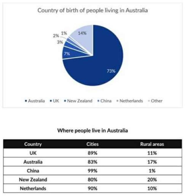
The pie chart presents data about the nation where the citizens of Australia were born,
while
the table illustrates where they live in the country.
From an Linking Words
overall
perspective, Linking Words
it is clear that
the majority of them originate in Australia and prefer to become residents of the capital. Linking Words
This
practice is more prominent for those in China, where hardly anyone lives in the countryside.
Looking at the details of the first graph, there are 73% of the country's people born internally, which is by far the greatest proportion among others. The United Kingdom and New Zealand followed, Linking Words
although
with significantly lower figures, with 14% and 7%, respectively; Linking Words
however
, China (2%) and the Netherlands (1%) received the fewest allocations.
Moving to the second diagram, almost every one of China's people lives in the town, which is by far the highest percentage among the others. The popularity of Linking Words
this
trend Linking Words
also
happened in the UK and Netherlands, where merely around 10% of their population stayed in rural areas.Linking Words