
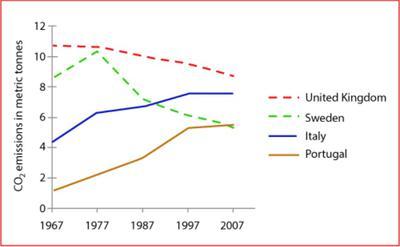
The line graph illustrates the average carbon dioxide
emissions
per person in 4 different countries (the United Use synonyms
Kingdom
, Sweden, Italy, and Portugal) over the period of 40 years from 1967 to 2007. Units are measured in metric Use synonyms
tonnes
.
Use synonyms
Overall
, It can be seen that the CO2 Linking Words
emissions
for both the United Use synonyms
Kingdom
and Sweden decreased over the years, Use synonyms
while
Italy and Portugal increased. Linking Words
Also
, during the whole period, the United Linking Words
Kingdom
had the highest record.
Regarding to United Use synonyms
Kingdom
's CO2 Use synonyms
emissions
, they stood at 11 Use synonyms
tonnes
and decreased constantly before reaching around 9 Use synonyms
tonnes
in the final year. Use synonyms
Likewise
, Sweden was about 9 Linking Words
tonnes
in the beginning and reached a peak of more than 10 Use synonyms
tonnes
in 1967 before falling significantly to approximately 6 Use synonyms
tonnes
in 2007.
Use synonyms
On the contrary
, Italy had around 4 Linking Words
tonnes
of CO2 Use synonyms
emissions
in 1967 and it rose until it reached 8 Use synonyms
tonnes
in the Use synonyms
last
year. Linking Words
Similarly
, Portugal started at 1 tonne and Linking Words
then
increased to nearly 6 Linking Words
tonnes
Use synonyms
at the end
of the period.Linking Words