
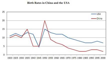
The line chart illustrates the rate of natality in
China
and the United States of America from 1920 to 2000.
Use synonyms
Overall
, Linking Words
it is clear that
Linking Words
although
the birth level in the USA is higher than in Linking Words
China
, both countries have negative trends.
Use synonyms
To begin
with, the growth of newborn babies in Linking Words
China
reached 10 in 1920, it was a slight gap under the USA's point and rose in the next five years until fell in 1930. Use synonyms
However
, the natality level in Linking Words
China
had some larger values in 1935 and 1950, which accounted for 15 and 20 which was the highest value during the eight decades. Use synonyms
In addition
, the babies in Linking Words
China
remained stable between 1940 and 1945, whilst the USAs' birth rates went to the bottom approximately at 5 in 1945.
Use synonyms
Furthermore
, there was a significant decline in newborn babies in Linking Words
China
from 1935 to the next five years and in America five years after that, Use synonyms
then
those reached the peak in 1950. Linking Words
In contrast
, both countries diminished in the next decades until Linking Words
China
had the lowest rank, which was under 5.Use synonyms