
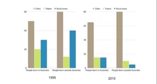
The bar chart illustrates that individuals born in the city and the countryside in
Australia
were changed by percentage between these towns in 1995 and 2010.
Use synonyms
Overall
, the maximum count of people born in 80% of cities in 2010 Linking Words
as well as
the minimum number of public living in rural areas was about 5% in 2010 outside Linking Words
Australia
.
Use synonyms
However
, inside Linking Words
Australia
, urban areas occupied people by 50% in 1995 and the same public saved 62% in 2010. Use synonyms
Also
, towns were public 20% in 1995 and 18% in 2010 similar to rural places. Linking Words
In addition
, villages increased their population by 30% in 1995.
Linking Words
Furthermore
, away from Linking Words
Australia
, the metropolis was born community by 60% in 1995 and it bloomed by 80% in 2010. Use synonyms
Additionally
, townships reduced people’s lives by 10% and it decreased by 2% in 2010. Villagers were 10% of individuals' lives in 2010 and it declined by 5% in 2010.
All data considered various exchanges in Linking Words
this
duration.Linking Words