
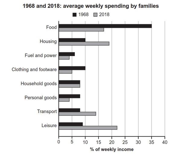
The bar chart illustrates the way households in one particular nation allocated their expenditures between 1968 and 2018.
Overall
, it is noticeable that the data clearly provided an upward and downward during observations. Linking Words
In addition
, Linking Words
while
, spending resources on housing, transport, and leisure increased, the percentage of weekly income of the rest participants actually dropped.
In 1968, the financial requirements of meals reached exactly 35%, before the figure went downhill to a halved level in 2018. Linking Words
On the other hand
, it coincided with houses, vehicles and leisure that inclined just almost 50%, just under 15% and over two-fold, respectively.
Linking Words
Moreover
, clothing and footwear, fuel and power, and personal goods, at the lower levels, initiated their numbers ranging 5 to 10% and Linking Words
then
they experienced to decrease moderately at approximately 30% for 50 years; meanwhile, the remaining category levelled off at the same point, accounting for just above 7.5% of weekly income.Linking Words