The graphs below give information about computer ownership as a percentage of the population between 2002 and 2010, and by level of education for the years 2002 and 2010.

The graphs below give information about computer ownership as a percentage of the population between 2002 and 2010, and by level of education for the years 2002 and 2010.
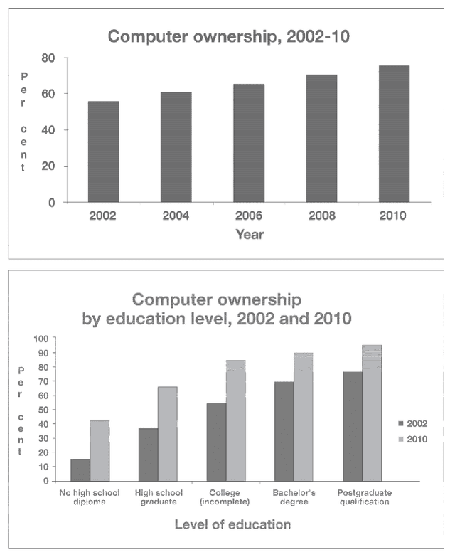
The given bar graphs show figures about the
percentage
of people who had computers between 2002 and 2010
as well as
a comparison by educational level in 2002 and 2010.
Overall
, there was an increase in computer ownership from 2002 to 2010. The level of education more often on the owner of
this
kind of electronic device was a postgraduate qualification. All levels presented an evolution
on
Change preposition
in
show examples
the
percentage
when compared to 2010 to 2002. The first chart depicts a constant improvement over the years, split into a two-year range. In 2002, the
percentage
of the population that bought a personal computer was about 55%. In 2010,
this
amount jumped to almost 75%.
This
graph indicates a positive trend for the next years. The second chart illustrates the same information,
however
, by education level and comparing only two years
instead
of five. People who do not have high school diplomas was the less frequent division, but it was the group that achieved the highest improvement, almost three times more from 2002 to 2010, from 15% to 45%, respectively. Bachelor's degree and postgraduate qualification are the clusters with a higher
percentage
,
Remove the comma
apply
show examples
and at the same time the group who increased less.
Submitted by fmulato on

Unauthorized use and/or duplication of this material without express and written permission from this site’s author and/or owner is strictly prohibited. Excerpts and links may be used, provided that full and clear credit is given to Writing9 with appropriate and specific direction to the original content.

Sentences: Add more complex sentences.
Vocabulary: Replace the words percentage with synonyms.
Vocabulary: Rephrase the word "give" in your introduction.
Vocabulary: The word "chart" was used 2 times.
Vocabulary: The word "graphs" was used 2 times.
Vocabulary: The word "percentage" was used 4 times.
Vocabulary: The word "improvement" was used 2 times.
Vocabulary: The word "increase" was used 2 times.
Vocabulary: The word "almost" was used 2 times.
Vocabulary: The word "about" was used 2 times.
Topic Vocabulary:
  • trend analysis
  • population demographics
  • educational attainment
  • disparities
  • technological advancement
  • digital divide
  • market penetration
  • socio-economic factors
  • predictive insights
  • statistical significance
  • longitudinal study
  • accessibility
  • affordability
What to do next:
Look at other essays: