
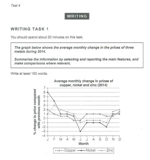
This
is the time series of the monthly average Linking Words
price
Use synonyms
change
of three materials in 2014. The graph explains the percentage of Use synonyms
price
Use synonyms
change
compared with the previous month. Use synonyms
For example
, the chart shown in February is the percentage of Linking Words
price
compared to January and so on. Three materials explained in the Use synonyms
line
chart are copper, nickel, and zinc, which are drawn in a dotted Use synonyms
line
with a white button, a straight bold Use synonyms
line
with a black button, and a straight light Use synonyms
line
with an x-letter button, respectively.
In the first four Use synonyms
months
, copper had positive changes at 1 to 2%. The next two Use synonyms
months
they had a decreased Use synonyms
price
at below minus 1% and Use synonyms
then
went up again in the next semester with a 0.5 to 2% Linking Words
price
Use synonyms
change
.
In the meantime, nickel and zinc had a relatively similar pattern. From January to May, they had an increased monthly Use synonyms
change
of prices and went down from June to October. After that, they got another increase in average prices two Use synonyms
months
ahead.
In summary, nickel and zinc only had two different trends, happening in February and December. Use synonyms
While
copper seemed to have a more constant increase in its monthly average Linking Words
price
in ten Use synonyms
months
, accumulatively, in 2014.Use synonyms