
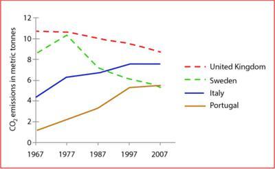
The given graph illustrates the average carbon dioxide emissions per person in the UK, Sweden, Italy and Portugal from 1967 to 2007.
Overall
, the CO2 emission rate of the United Kingdom showed a downward trend Linking Words
while
those of Italy and Portugal depicted an upward trend throughout the given timeframe.
Linking Words
First,
COZ emissions in the UK stood at around 11 metric Linking Words
tons
in 1967. Use synonyms
Next,
it constantly decreased and reached about 9 Linking Words
tons
in 2007. When it comes to the figure for Sweden, it started from approximately 8 Use synonyms
tons
in the beginning and peaked at 10 Use synonyms
tons
in 1977. Use synonyms
Then
, it dramatically declined after a decade and reached 7 Linking Words
tons
. Use synonyms
Subsequently
, it dropped slightly and became the least country which emits the CO2, with less than 5 Linking Words
tons
.
Use synonyms
However
, CO2 emissions in Italy Linking Words
was
almost 4 Change the verb form
were
tons
in 1967. It gradually rose until it reached about 7 Use synonyms
tons
in 1967. After that, it levelled out for the next decade. Use synonyms
Lastly
, the amount of CO2 emission in Portugal was below 2 Linking Words
tons
in 1967. Use synonyms
However
, it significantly grew to 5 Linking Words
tons
in 1997. Use synonyms
Following
Linking Words
this
, it rose marginally in 2007, to about 5.2 Linking Words
tons
.Use synonyms