
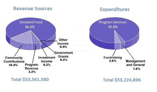
The pie graph displays the amount of expenditures and revenue sources of a children's charity organization in the USA in 2016.
We can clearly see from the pie chart that donated food is the primary revenue source,
while
community contributions are taking second place. Linking Words
According to
expenses, it is obvious, that most of the money is spent on the program services.
Through the pie chart of received money, we can easily understand that the most, what is 86,6%, comes from donated food. Linking Words
Then
around 10% from community contributions, 2,2% from program revenue, 0,2% through investment income and the same percentage from government grants. Based on the expenses chart we know that around 95% is spent on program services. Linking Words
Also
, we see fundraising, management and general, both of which take 2% of received money that year.
In total, it is stated that the difference between income and outcome is around 300000.Linking Words