
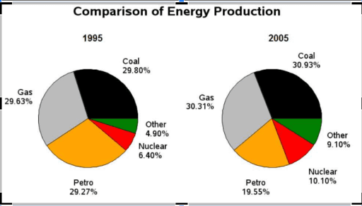
The charts illustrate 4 various energy sources in a country in 1995 and 2005. Units are measured in percentage.
Overall
, what stands out from the chart is that the percentages of coal and gas Linking Words
production
represented the highest share, Use synonyms
whereas
the proportions of nuclear and other energy Linking Words
production
made up the lowest in both years.
Moving to a more detailed analysis, the indicators of gas, coal, and petrol Use synonyms
production
were at approximately the same level, each section accounted for merely 29% in 1995. The figures for gas and coal increased to almost 30%, Use synonyms
by contrast
, the share of petrol decreased to 20% in 2005.
With regard to nuclear and other productions, they stood at 6.40 and 4.90 respectively at the beginning of the period. There was a dramatic rise in nuclear share, at 10.10%, Linking Words
while
the rate of other energy Linking Words
production
went up by a margin of 4.2% Use synonyms
at the end
of the period.Linking Words