
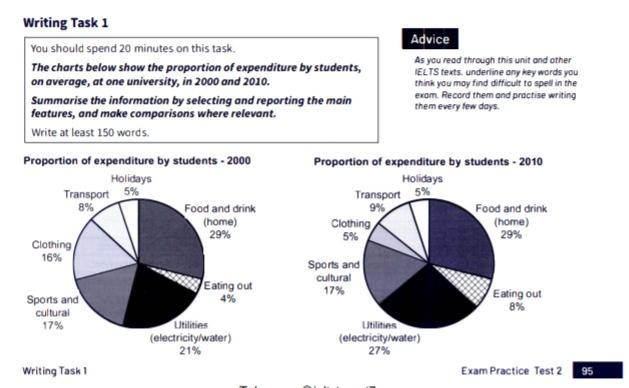
The charts below represent the proportion of spending by students, generally, at one institute, in 2000 and 2010.
First and foremost, food and drink (home) constituted the highest share of the
left
pie chart, accounting for 29%. Correct word choice
apply
Secondly
, 21% of the chart comprised utilities, water, and electricity, to be precise. Linking Words
Moreover
, in 2000, money was Linking Words
also
spent on clothingLinking Words
and
sports and cultural activities, standing for 16% and 17%. Punctuation problem
,
Also
, holidays and eating out parts constituted a minor percentage of the left chart, having 5% and 4%, respectively. The transport Linking Words
section
amounted to 8%.
Turning to 2010, expenses on food and drinks at home stayed at the same level, 29%. Use synonyms
However
, the amount of money spent on utilities grew from 21% to 27%. Linking Words
Furthermore
, there was a marked decrease in the clothing part, as in 2010 it constituted 5%. Meanwhile, the sports and cultural activities Linking Words
section
remained the same. Use synonyms
In addition
, the transport and eating out categories slightly rose to 9% and 8%. Linking Words
Holidays
Correct article usage
The holidays
section
showed no change.
Taken as a whole, major changes happened to the utilities Use synonyms
section
by 2010, showing a rise from 21% to 27%. Use synonyms
Nevertheless
, expenditure on clothing plunged to 5%.Linking Words