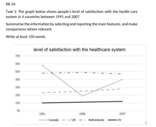
The graph below shows people’s level of satisfaction with the health care system in 4 countries between 1991 and 2007. Summarize the information by selecting and reporting the main features, and make comparisons where relevant.

7.5 / 9
✍️ Want to check your own essay?Write on this topic →
The graph below shows people’s level of satisfaction with the health care system in 4 countries between 1991 and 2007. Summarize the information by selecting and reporting the main features, and make comparisons where relevant.
IELTS Writing Task Chart for The graph below shows people’s level of satisfaction with the health care system in 4 countries between 1991 and 2007. Summarize the information by selecting and reporting the main features, and make comparisons where relevant.
The presented line graph compares the proportion of people who were satisfied with the healthcare services in 4 different countries over the period of 16 years from 1991 to 2007. It is clear from the graph that the Netherlands and Canada still recorded the highest levels of public satisfaction despite contrasting trends,
whereas
Linking Words
the UK and the US remained at the lower end of the scale. It is
also
Linking Words
noticeable that Canada experienced the most significant fluctuation over the 16-year period.
Initially
Linking Words
, Canada had the highest percentage of pleased citizens at 58% in 1991, but
this
Linking Words
figure plummeted to a low of just around 20% in 1998 before recovering to 40% in 2007.
Conversely
Linking Words
, the share of satisfied dwellers in the Netherlands stayed relatively stable, starting at 48% in 1991, and
then
Linking Words
keeping unchanged in 1998 and finishing at roughly 46%
at the end
Linking Words
of the timeframe. Looking at the remaining nations, the UK witnessed a gradual upward trend, with its satisfaction rate rising steadily from 23% to nearly 30% over the period. Meanwhile, the figures for the US were the lowest, showing minimal changes and staying almost unchanged
right
Punctuation problem
, right
show examples
above 10% throughout the entire sixteen years.

Unauthorized use and/or duplication of this material without express and written permission from this site's author and/or owner is strictly prohibited. Excerpts and links may be used, provided that full and clear credit is given to Writing9 with appropriate and specific direction to the original content.

Vocabulary: The word "graph" was used 2 times.
▼
Vocabulary: The word "figure" was used 2 times.
▼
Vocabulary: The word "figure" was used 2 times.
▼
Vocabulary: The word "trends" was used 2 times.
▼
Vocabulary: The word "unchanged" was used 2 times.
▼
What to do next:
Look at other essays: