
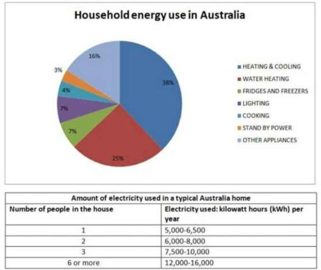
The chart indicates the proportion of where energy is used in a typical Australian household in seven different usages based on the amount of electricity
according to
the number of occupants.
Linking Words
Overall
, it can be seen in the pie chart that there was a significant difference between the percentage of heating and cooling 38% and standby power 3% in household energy Linking Words
usage
in Australia. Use synonyms
In addition
, the same percentage to each lighting and fridges and freezers. Both are 7%. Now we have three percentages 4%, 16%, and 25% for cooking, other appliances, and water heating.
Linking Words
On the other hand
, we can see that the table shows the amount of electricity used increases as the number of people in Linking Words
a typical Australian home roses
. If we have one person in the house, we'll Correct the article-noun agreement
a typical Australian home rose
typical Australian home roses
Use synonyms
usage
5000-6000 kWh per year. Replace the word
use
Then
, if we have 2 or 3 persons we'll Linking Words
Use synonyms
usage
6000-8000 and 7500-10000 kWh per year. Replace the word
use
Finally
, if we have 6 persons or more, we'll duplicate to 12000-16000 kWh per year.
We can sum up the Linking Words
above mentioned
Add a hyphen
above-mentioned
date
by saying that the household energy Correct your spelling
data
usage
in Australia percentage. Had a lot of ups and downs Use synonyms
according to
the number of occupants.Linking Words