
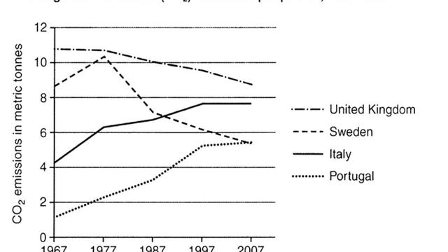
The line graph illustrates the amount of typical carbon dioxide
emissions
per capita released in four separate countries in a 40-year period from 1967 to 2007.
Use synonyms
Overall
, the levels of average CO2 Linking Words
emissions
per capita in the United Kingdom fell slightly; Use synonyms
therefore
, the figure for Sweden changed more dramatically during Linking Words
this
period. Linking Words
However
, CO2 Linking Words
emissions
by individuals in Italy and Portugal showed a rise.
Carbon dioxide Use synonyms
emissions
in the United Kingdom and Sweden decreased during the same period. The United Kingdom has a smoothly dropping trend from less than 11 metric Use synonyms
tonnes
in 1967 to approximately 9 metric Use synonyms
tonnes
in 2007. Use synonyms
Furthermore
, Linking Words
thought
a little increase in 1977, the amount of carbon dioxide Correct your spelling
though
emissions
in Sweden decreased from 8.5 to less than 6 metric Use synonyms
tonnes
per head.
In the other two countries, there were significant increases in the CO2 emitted by Italians and Portuguese over the 40 years. Use synonyms
While
the amount created by Italians grew from nearly 4.5 to more than 7.5 metric Linking Words
tonnes
over these 40 years, Portuguese per capita output increased almost fivefold, reaching approximately 5.5 metric Use synonyms
tonnes
in 2007.Use synonyms