
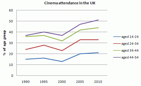
The given line graph illustrates information on the percentage of people who went to the movies in the United Kingdom between 1990 and 2010. The people’s attendance is divided into four different groups.
Overall
, all the rates saw an upward trend throughout the given Linking Words
period
despite some harmonic fluctuations. They almost followed a fairly similar pattern until the end of the Use synonyms
period
. Use synonyms
However
, the highest rate of all Linking Words
the
ages belonged to elderly people throughout the whole time frame. Correct article usage
apply
While
respectively, the lowest rate was recorded for the youngest group.
Between the first five years, all the percentages had an increase, but not as sharp as the group Linking Words
age
24 to 34 (the highest in 1995, about 40% of them). From the beginning of 1995 until 2000, they all interestingly fell and witnessed their lowest rate over the Replace the word
aged
period
in 2000.
By the Use synonyms
next
five years, the figure showed a notable and significant rise for all groups by the year 2005. The recordings progressively continued to grow up by getting the Linking Words
last
time Linking Words
period
, with the exception of the ages 24 to 34 that was remaining steady.Use synonyms