
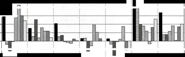
A glance at the diagram provided reveals the significant variations in salaries among 7 different countries between 2000-2007 and 2008-2012.
Overall
, it vividly can be seen that the earning figures of the USA and the UK in the first decade were higher Linking Words
whereas
over the Linking Words
last
Linking Words
period
there was a decline. Add a comma
,period
However
, France and Germany had converse trends over these two periods. Canada faced stable rates in both periods.
It is interesting to note that the rates of the United Kingdom and the United States were comparable to the first 7-year period. And Linking Words
then
Linking Words
following
by a plummet in the salaries of British people from 2008 to 2012 at nearly 2%. But in Unites states the figures had a steady trend.
The data of Japan fluctuated throughout the given period, having maximum growth and fall by 2 Wrong verb form
followed
percent
. With regard to European countries, Germany and France had a constant rise in wages with some periods when the data remained unchanged, meanwhile, Italian gains figures dipped by 2 Change the spelling
per cent
percent
. Canada was the only country, where Change the spelling
per cent
was
the most climb in salaries each year to 3-4 Unnecessary verb
apply
percent
.Change the spelling
per cent