
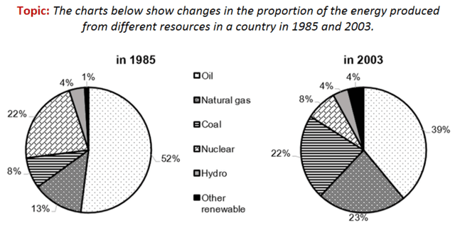
The given pie charts depict the percentage illustration of
the
energy produced by various sources in a country from 1985 to 2003
Correct article usage
apply
Overall
, it can be observed that oil was the biggest energy-giving source through the years. Linking Words
As well as
, Hydrogen remained the least among Linking Words
main
modes, and even more, stood at the same index all the time.
With regards the power sources increased in proportion, as one of the Correct article usage
the main
most
bright ones Natural has from 13% up to the 23%, Correct quantifier usage
apply
then
comes Coal with rose by 5%. Linking Words
Despite
, another renewable was Correct pronoun usage
thisDespite
in
the bottom in 1985, by 2003 it equalised in rate with Hydrogen.
Change preposition
at
On the other hand
, some of the energy sources went down in Linking Words
the
percentage amount, like Oil, which decreased by almost 15%, from 52% to 39%, relatively. Nuclear is one more example of Correct article usage
apply
this
trend. It dropped up to 17% from 22%.Linking Words