
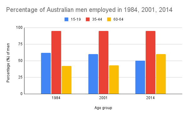
The graph compares the proportion of male and female employees In Australia in 1984,2001 and 2014
accordingly
to their age.Significant differences between these gender groups are evident.
As can be seen from the bar chart middle-aged workers prevailed across all the Linking Words
years
and ages,except women in 1984,when the proportion was almost equal with teenagers,just under 60%.It is noticeable,that the least share was in the oldest age category.Use synonyms
However
,in 2014 it slightly outnumbered the youngest one reaching the point of 60%.
Looking into details,in 2001 the statistics for men and women followed a similar pattern,Linking Words
whereas
fifteen Linking Words
years
before,it had some differences.Use synonyms
For example
,there were Linking Words
less
35-44 Correct quantifier usage
fewer
years
old female workers compared to those,under 20 Use synonyms
years
old, though for male ones it was the opposite.As the data suggests,in 2014 there teen female employees were Use synonyms
second
highest after the group of 35-44, in sharp contrast to their male counterparts.Linking Words