
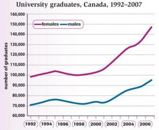
The graph illustrates the quota of university graduates of each sex from 1992 to 2007 in Canada.
Overall
, both sexes had a similar trajectory of growth which has Linking Words
as a result
more students graduating in 2007 when compared with the other years.
Linking Words
Therefore
, the vast majority of people that concluded their higher education degree are female in all the time periods presented. Linking Words
Moreover
, both sexes' lines had a significant fluctuation that turned into a surge between 2001 and 2006.
Linking Words
Nevertheless
, the graph remained practically steady between 1997 and 2000. Linking Words
Furthermore
, a slight rise and reduction could be observed in 1995 for both categories and in 2000 for the male students' chart.
Linking Words
Additionally
, in 1992 only a hundred thousand women graduated whilst in 2007 almost a hundred 50.000 completed their course, Linking Words
hence
an increase of fifty thousand. Linking Words
Whereas
men have shown an improvement of only twenty thousand in the same period.
In conclusion, in Canada in the 15 years time frame given by the data, women seek more education than the opposite sex.Linking Words