The chart below gives information about how families on one country spent their weekly income 1968 and in 2018

The chart below gives information about how families on one country spent their weekly income 1968 and in 2018
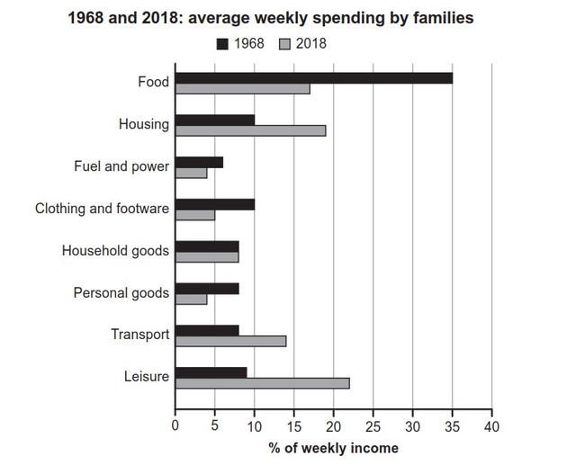
The following chart shows the percentage of average weekly spending money on 8 various usages in a certain country in two given years ( 1968 and 2018 ).
Overall
, the majority of usage fell significantly in the five decades. In 1968, the maximum expenditure is food by 35%
while
the minimum spending of money on electricity by 7%. Ranked two are housing and clothing by 10%. The rest of the others are roughly similar to the figure 8%. In 2018, it's clear that food usage fell significantly by 17%. Ranked two are housing, transport, and leisure sharp increase in the order of 18%, 14%, and 22%. The household goods are not changed by 8%.
Submitted by Niyoshakhalili on

Unauthorized use and/or duplication of this material without express and written permission from this site’s author and/or owner is strictly prohibited. Excerpts and links may be used, provided that full and clear credit is given to Writing9 with appropriate and specific direction to the original content.

Sentences: Add more complex sentences.
Common mistake: Your writing should be 150-250 words.
Vocabulary: The word "fell" was used 2 times.
Vocabulary: The word "significantly" was used 2 times.
Topic Vocabulary:
  • Weekly income
  • Expenditure
  • Consumption patterns
  • Cost of living
  • Discretionary spending
  • Inflation
  • Economic indicators
  • Demographics
  • Socio-economic factors
  • Technology advancements
  • Government policies
  • Consumerism
  • Lifestyle changes
  • Fiscal habits
  • Budget allocation
  • Financial priorities
  • Societal trends
  • Purchasing power
  • Income distribution
What to do next:
Look at other essays: