
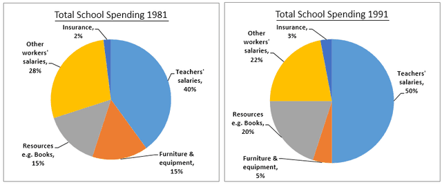
These pie charts illustrate the statistic about the proportion of United Kingdom schools in 1981, 1991 and 2001. It is clear from the graph that, the teacher's
salaries
had the highest spending in all of the three years.
Use synonyms
According to
what is shown Linking Words
firstly
, in 1981, the other worker's Linking Words
salaries
were the second highest per Use synonyms
cent
at 28% Use synonyms
in addition
to resources e.g. Books, and furniture and equipment were exactly the same ratio at 15% and insurance at 2 per Linking Words
cent
.
Use synonyms
Secondly
, in 1981, teachers' Linking Words
salaries
were exactly half Use synonyms
while
all the other features represent the other half with approximately the same percentage as the Linking Words
last
decade except the furniture and equipment decreased by 10 per Linking Words
cent
which is considerably high .
Use synonyms
Finally
, in 2001, the furniture and equipment increased since the Linking Words
last
decade by 18 per Linking Words
cent
Use synonyms
furthermore
other worker's Linking Words
salaries
and resources both declined by 16 per Use synonyms
cent
in totalUse synonyms