
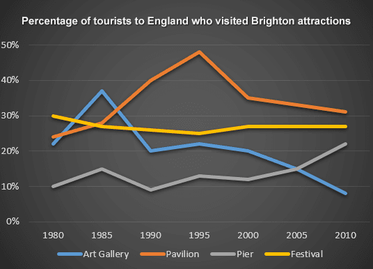
The line graph compared the proportion of travellers visiting four famous places in Brighton when they went to England.
Overall
, Linking Words
while
the percentage of tourists to the Pier and Pavilion increased from 1980 to 2010, that for Art Gallery Linking Words
as well as
the Festival dropped.
In 1980, Pier attracted only 10% of the number of visitors to England, but the proportion for Pavilion was much higher, at about 24%. Between 1980 and 2000, Pier witnessed a significant fluctuation in the data of visitors before growing to 21% in 2010. Meanwhile, the figure for Pavilion reached its peak of 49% in 1995, Linking Words
then
dropped considerably to 30% Linking Words
at the end
of Linking Words
this
period.
Linking Words
By contrast
, approximately 20% of tourists who went to the UK visited Art Gallery in 1980, Linking Words
whereas
the Festival had the most visitors, which accounted for 30% of the country's travellers. 5 years later, the Art Gallery's figure rocketed to 38%, but Linking Words
this
fell sharply to merely 8%, being the least attractive destination among 4 attractions in 2010. Linking Words
Besides
, the percentage of people who participated in the Festival, which just declined very modestly by 2%, remained quite stable after the period of 30 years.Linking Words