
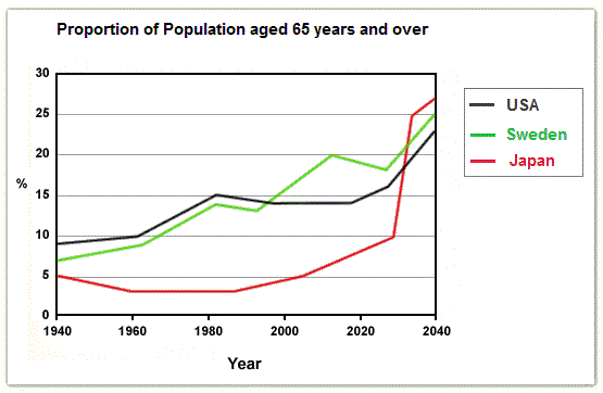
This
graph provides data from three countries regarding individuals aged 65 years old and older between 1940 and 2040.
The Y-axis shows the percentage Linking Words
whereas
the X-axis shows six different years.
Linking Words
To begin
with, I would like to focus your attention on two important points.
The first one is Japan, it started with the lowest percentage, 5% in 1940. Linking Words
However
, it ends up with the highest percentage, about 27% in 2040. The second point is the USA which started with the highest proportion just below 10% and Linking Words
subsequently
managed to be the lowest of all three countries in 2040 with a proportion between 20% and 25%.
Linking Words
Furthermore
, an Linking Words
overall
analysis of Linking Words
this
graph shows that all three countries, Japan, USA and Sweden have an increased proportion throughout the years, as all of them have started between 5% and 10% in 1940 and reached over 20% in 2040. Linking Words
Therefore
, Linking Words
this
provides evidence that life expectancy has improved.Linking Words